The graphs below give information about commuting inside and outside London in 2009.
Summarise the information by selecting and reporting the main features, and make comparisons where relevant.
The graphs show_________________________________________________________________
______________________________________________________________________________________________________________________________________________________________________________________________________________________________________________________________________________________________________________________________________________________________________________________________________________________________________________________________________________________________________________________________________________________________________________________________________________________________________________________________________________________________________________________________________________________________________________________________________________________________________________________________________________________________________________________________________________________________________________________________________________________________________________________________________________________________________________________________________________________________________________________________________________________________________________________________________________________________________________________________________________________________________________________________________________________________________________________________________________________________________________________________________________________________________________________________________________________________________________________________________________________________________________________________________________________________________________________________________________________________________________________________________________________________________________________________________________________________________________________________________________________________________________________________________________________________________________________________________________________________________________________________________________________________________________________________________________________________________________________________________________________________________________________________________________________________________________________________________________________________________________________________
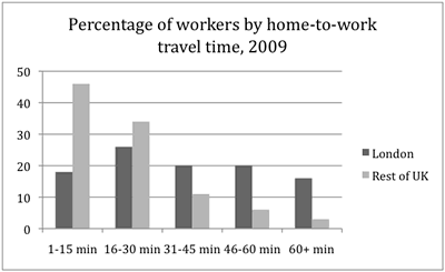
Commuting
inside and outside London in 2009
The g_____s
show the t____e it t_____s employees __ commute to their w____places , and the
m___e of transport they use . F____s are g____n for b___h inside and outside
London.
For the m_______y of the UK , the number of commuters d_______s as commuting
time i_______s . Almost h___f of the commuters take l___ than 15 minutes to get
to their place o__ work , while only around 3 p______t s_____d over an hour
commuting . Indeed , three quarters of commuters o______e London reach work
within half an h___r . In London , the trend is very d_______t . The figures s___w
that it takes m___h longer to get to work . Less than half of the commuters
have reached work within half an hour , with the p________e reaching work in
less than fifteen minutes s_________y lower than the p________e reaching work
in thirty m_______s . M_______r , forty percent of people spend up to an hour
commuting , with an e______l proportion in the 30-45 minute bracket and the
45-60 minute bracket , and a further sixteen p_______t commute for over an hour
– over five times the proportion outside London .
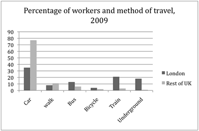
Regarding the m___e of transport , the car is dominant b___h inside and outside
London , significantly so outside London , where other m____s of transport
account for less than a quarter of j_______s . Of the other modes of transport
, w_____g and taking the bus are more c_______n than cycling , taking the train
and using the u________d . Inside London , the car accounts for a_____t one
third of commuting journeys . However , public transport is used for a_____t
half of the journeys , the train and underground being more p________r than the
bus .
The table below shows CO2 emissions for different forms of transport in the European Union. The Pie Chart shows the percentage of European Union funds being spent on different forms of transport.
| CO2 emissions per passenger kilometre |
 |
EU Funds for transport 2007-2013
per
methods
greatest
next
make up
as trains do
budget
amount
a further
as much as
cleanest
nearly
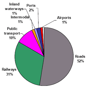
Very little is spent by the EU on air travel while roads represent more than half of the EU transport expenditure.
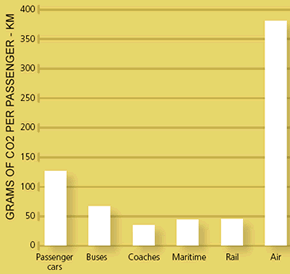
Trains produce about three times less CO2 emissions per passenger kilometre than passenger cars and eight times less than air travel. Almost a third of EU transport funds are spent on railways .
Ships are a clean form of transport and produce about the same quantity of CO2 per passenger kilometre compared with trains. However, only 2 percent of EU funds are spent on ports. Another one percent is spent on inland waterways .
Coaches are the least polluting form of transport. Emissions of CO2 per passenger kilometre from coaches are half those of buses. Buses emit less than half as much CO2 per passenger kilometre as cars. The European union spends 10 percent of its transport budget on public transport, such as buses and coaches .
methods
by far
shows
than
more than
as much as
on
as
less than half as much
the same
the cleanest
form
such as
less than
largest
by far
less
per
Very little is spent by the EU on air travel while roads make up _______ half of the EU transport budget .
Trains produce about three times _______ CO2 emissions per passenger kilometre ______ passenger cars and eight times ________ air travel . Nearly a third of EU transport funds are spent on railways .
Ships are a clean ________ of transport and produce about ________ amount of CO2 per passenger kilometre ______ trains do . However, only 2 percent of EU funds are spent on ports . A further one percent is spent on inland waterways .
Coaches are ________ form of transport . Emissions of CO2 per passenger kilometre from coaches are half those of buses. Buses emit ________ CO2 per passenger kilometre as cars. The European union spends 10 percent of its transport budget on public transport , ______ buses and coaches .
No comments:
Post a Comment